The Editing Trick That Brings Photos to Life
When it comes to editing photos on your smartphone, there are a few sliders that can make or break your results. Two of the most confusing ones are Vibrancy and Saturation. At first glance, they look like they do the same thing: both make colors pop. But the way they work and the effect they have on your image is very different.
As someone who has spent countless hours teaching smartphone editing in my workshops, I can say that understanding this distinction can save you from a lot of “why does my photo look weird?” moments.
What’s the Difference?
Vibrancy: Boosts the intensity of muted colors while protecting skin tones and avoiding oversaturation. Think of it as a selective, thoughtful enhancement.
Saturation: Increases the intensity of all colors equally, which can quickly make your photo look overcooked or unnatural.
That’s why Vibrancy is my favorite tool when working with people, skin tones, or subtle details.
A Quick Office-Friendly Experiment
Here’s an easy way to see the difference for yourself, even if you’re at your desk right now:
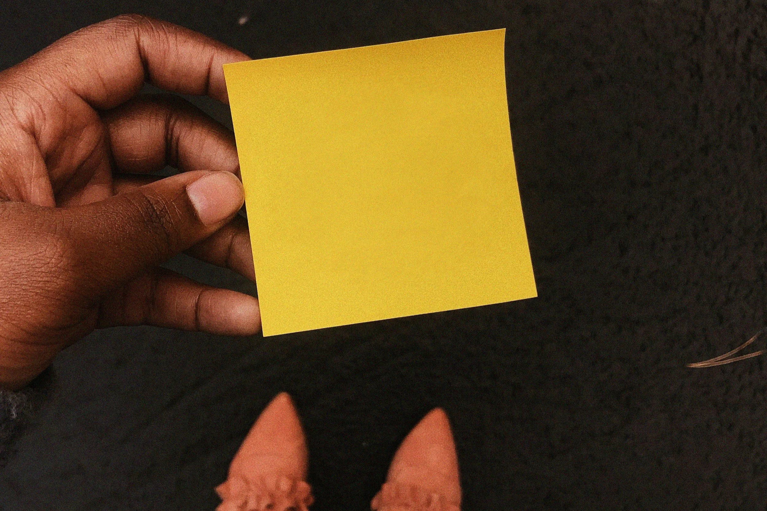
Grab a few brightly colored Post-it notes.
Hold them against your hand (your palm works great for this).
Take a quick photo.
Open it in your editing app of choice.
First, slide the Vibrancy up and see how the Post-its become livelier while your skin tone stays balanced.
Now, reset and do the same with Saturation. You’ll notice how your skin suddenly shifts along with the Post-its (often in ways that don’t look flattering).
This simple test shows you why Vibrancy is usually the safer, more professional choice, especially for photos that include people.
Why Teams Can Try This Together
This little experiment works well in team settings too. Imagine a group of colleagues around a table, each with their Post-its and phones, comparing how the sliders affect their photos. It’s quick, fun, and gives everyone a shared “aha” moment. These small exercises are exactly how I help teams build creativity and learn how to see images differently in my online mobile photography workshops.
Pro Tips
Start with Vibrancy and only touch Saturation if you still feel the image needs more punch.
Don’t be afraid to leave Saturation at zero (many of the best edits don’t need it at all).
Try the experiment again with different backgrounds: a notebook, a coffee cup, or even your office wall.
Wrapping Up
By learning to use Vibrancy over Saturation, you’ll make your edits look more natural, polished, and professional. It’s a small shift in workflow that has a big payoff whether you’re editing photos for fun or using them as part of a team’s creative challenge.
So next time you’re about to boost the colors in your photo, remember the Post-it trick. And if you want to dive deeper into how smartphone photography can boost creativity and team spirit, check out my online sessions for employee engagement professionals, HR managers, and teams.

